Presentation Design
-
Presentations where the visual language was created from scratch to match the speaker, the topic, or the organization
-
Presentations designed within strict branding guidelines
while solving complex communication challenges -
Adapting a single presentation system to support different topics, speakers, and communication goals
Building a Visual Identity
Presentations where the visual language was created from scratch to match the speaker, the topic, or the organisation
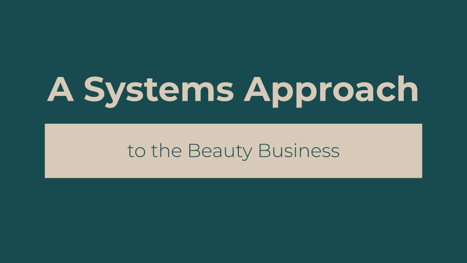
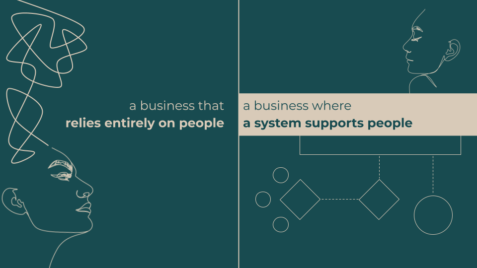
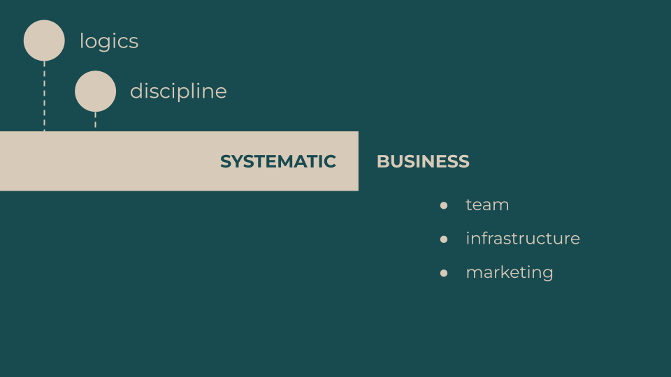
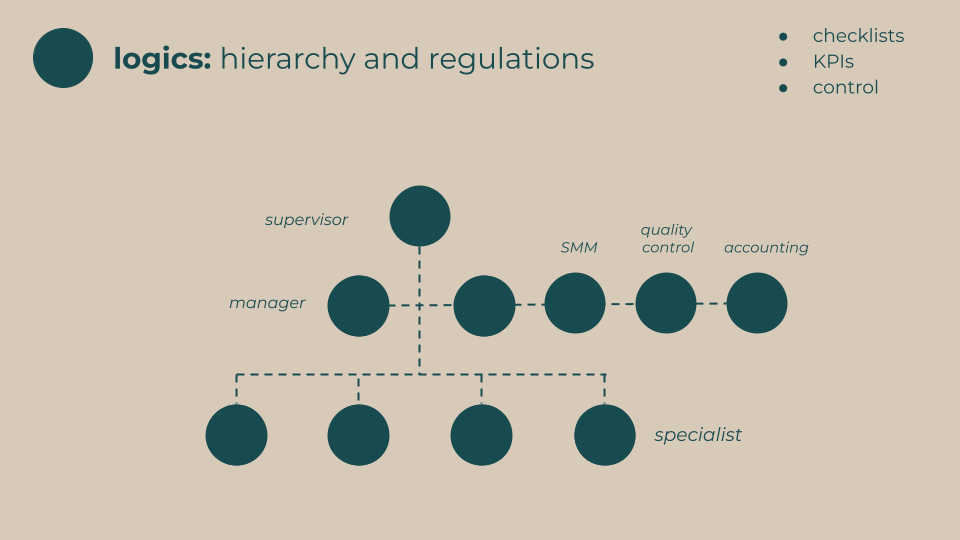
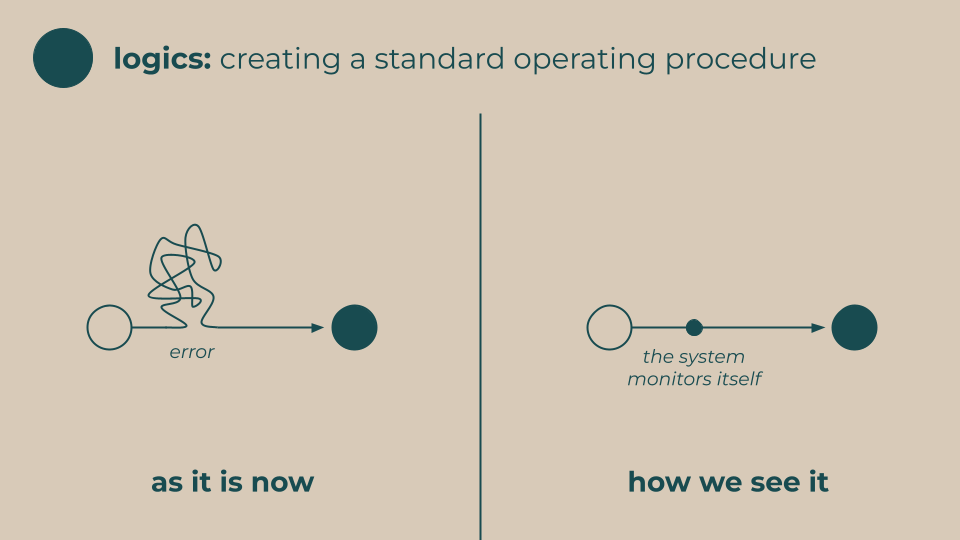
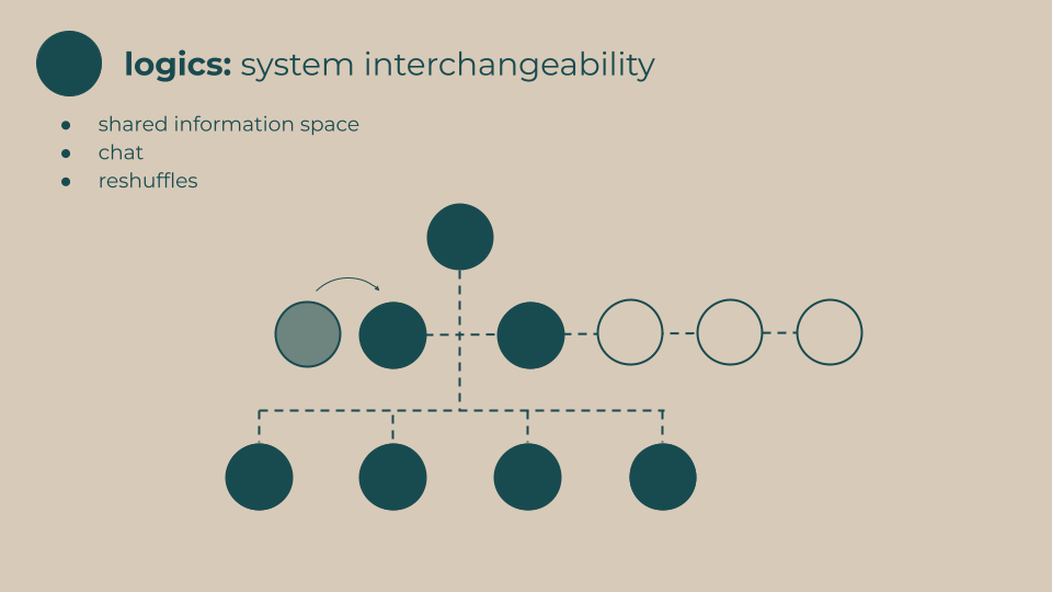
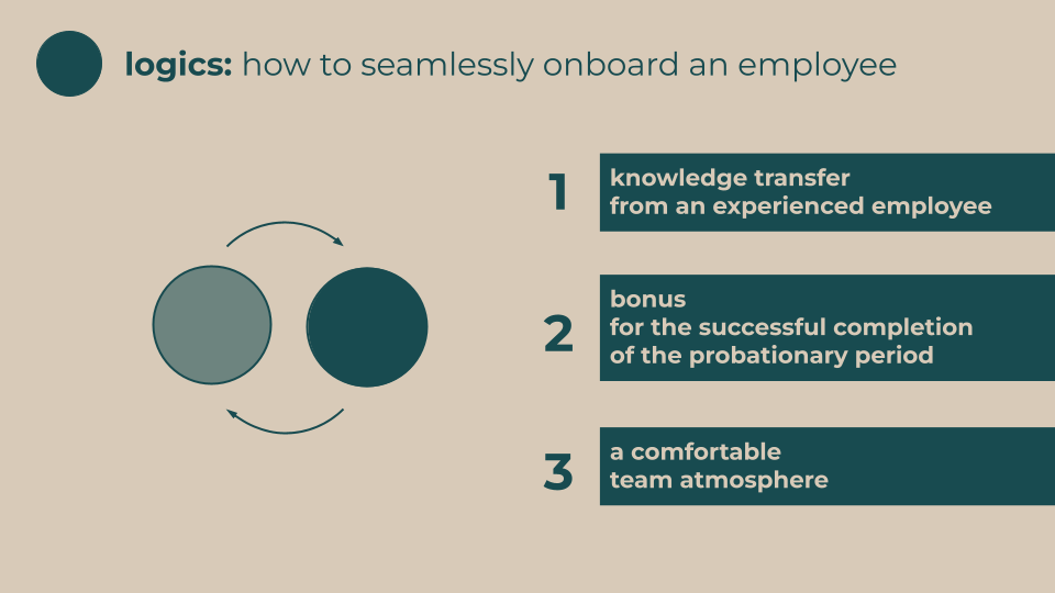
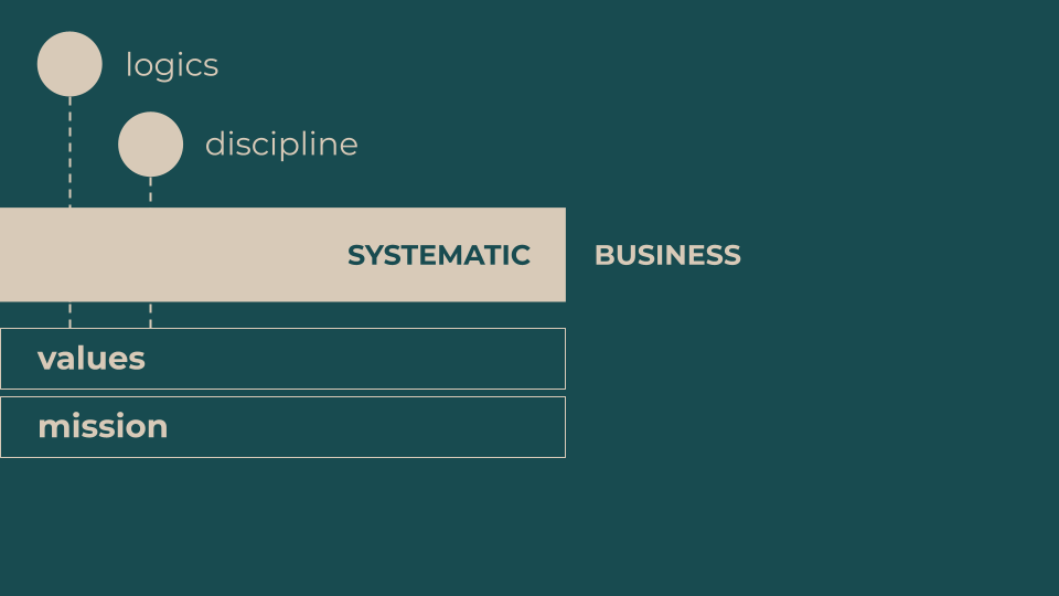
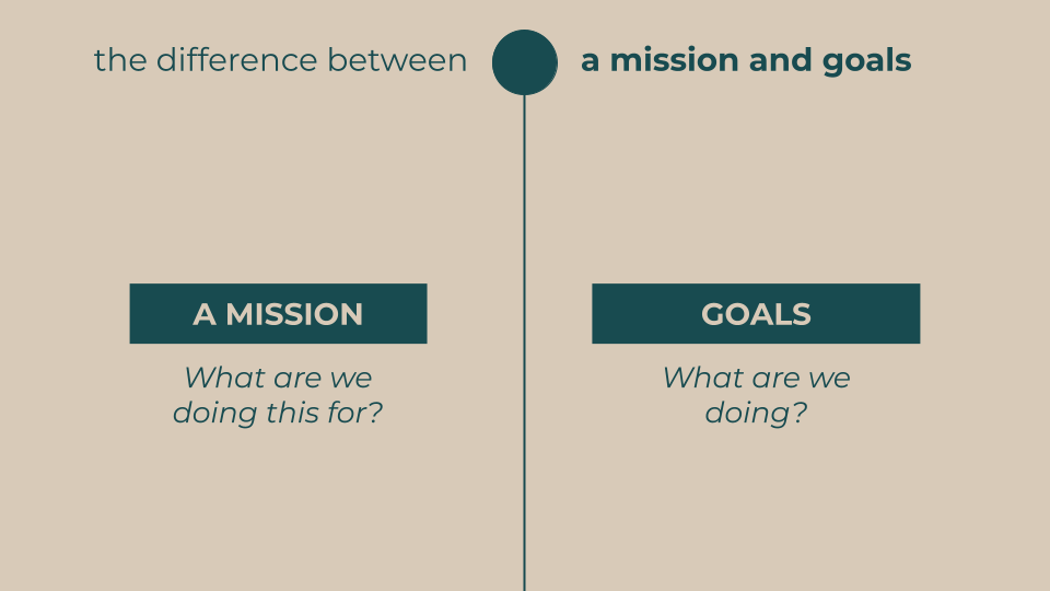
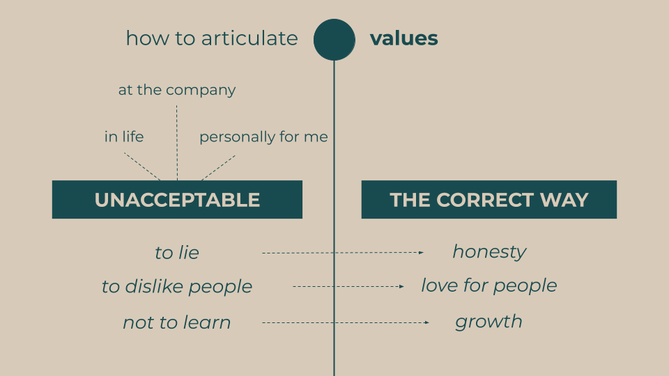
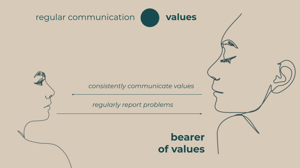
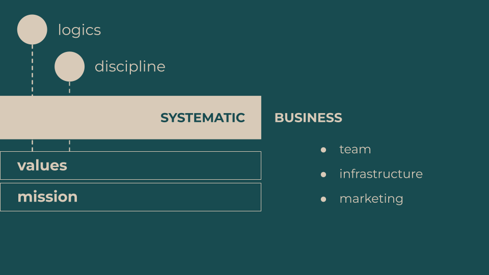
This presentation was created for the owner of a beauty salon chain giving a lecture on how to transform a people-dependent business into a scalable system without compromising quality.
Since the company didn’t have an established brand identity or presentation guidelines, I developed a visual style inspired by the interiors of the salons. The color palette, typography, and graphic elements were designed to reflect the atmosphere of the physical spaces while creating a clear and professional presentation for a business audience.
The presentation focused on business systems, processes, and scaling, so the visual language needed to communicate structure and consistency while maintaining the brand’s welcoming and elegant character.
Designing Within Constraints
Presentations designed within strict branding guidelines while solving complex communication challenges
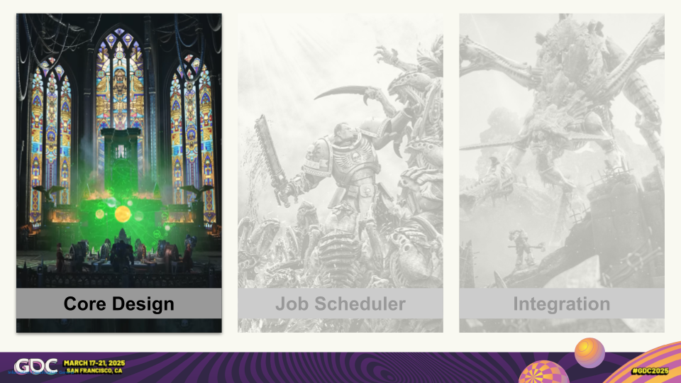
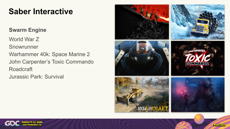
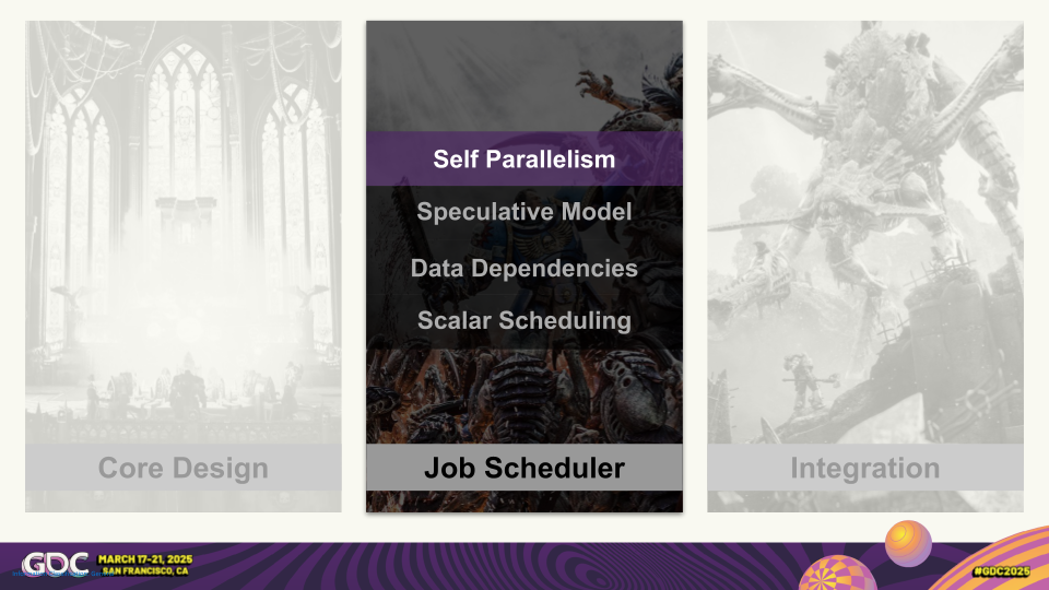
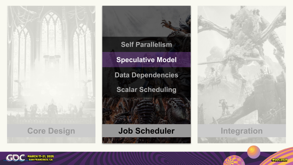
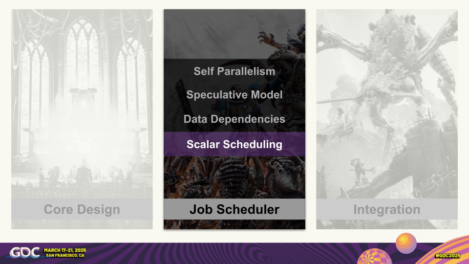
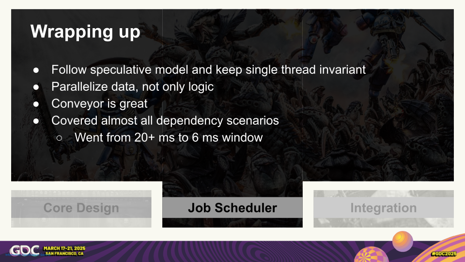
This presentation was created for a game development expert speaking about the technical challenges behind the development of a video game.
The project required balancing several goals. The presentation needed to communicate complex technical concepts using code snippets, diagrams, and system architecture, while also showcasing the visual quality of the game through screenshots and gameplay graphics. At the same time, the entire presentation had to comply with the conference’s branding guidelines, including its color palette, background, footer, and template requirements.
Unlike many presentation projects where visual identity can be developed freely, this project was defined by strict constraints. The challenge was not to create a new visual language, but to make highly technical content clear and engaging while working entirely within an existing conference template.
The result balances three different layers of information: technical explanations for a professional audience, visual storytelling through the game’s artwork, and consistent compliance with the event’s branding requirements.








One Template,
Different Stories
Adapting a single presentation system
to support different topics, speakers, and communication goals
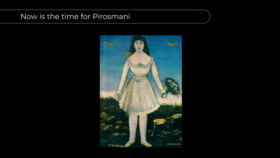
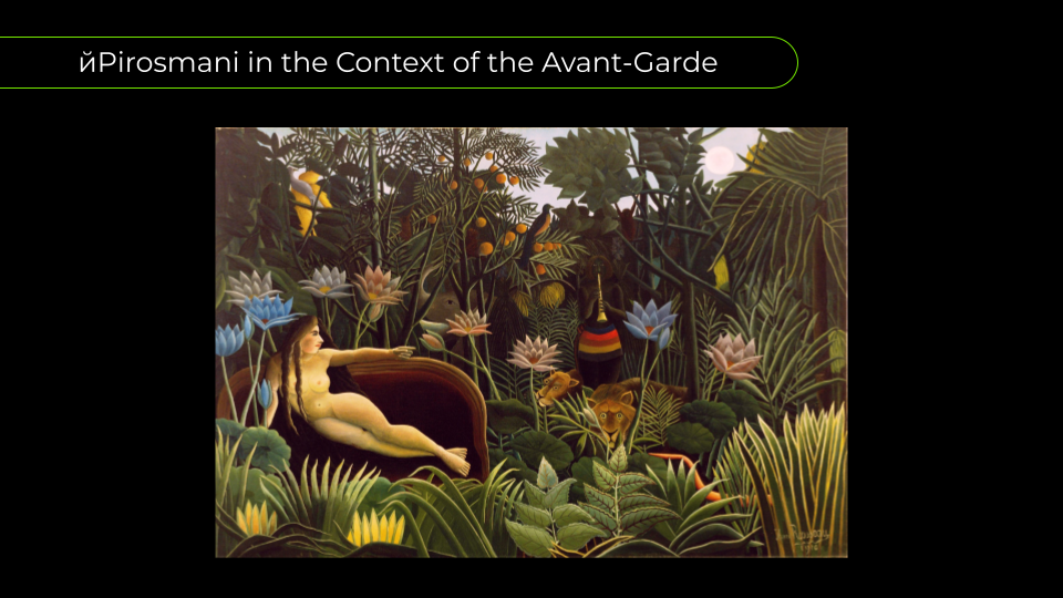
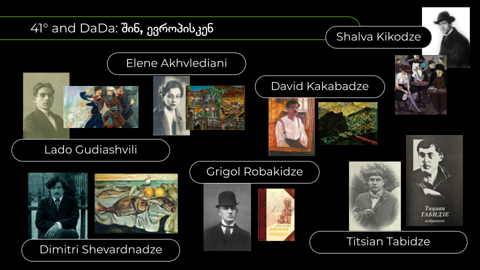
These presentations were created for Paper Kartuli, a media that regularly hosts public lectures and educational events in a dark bar venue using a projector. Through multiple events, we found that a dark background with high-contrast typography provided the best readability in this environment. Based on this experience, I developed presentation design guidelines for the organization, including recommendations on slide layouts, typography, and color usage.
The green accent color used throughout the slides is part of Paper Kartuli’s visual identity.
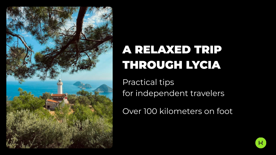
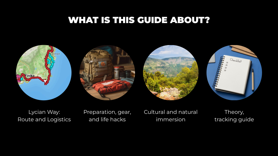
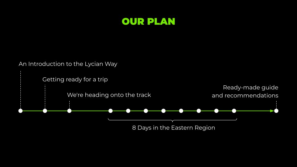
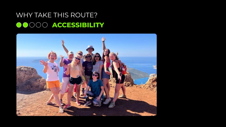
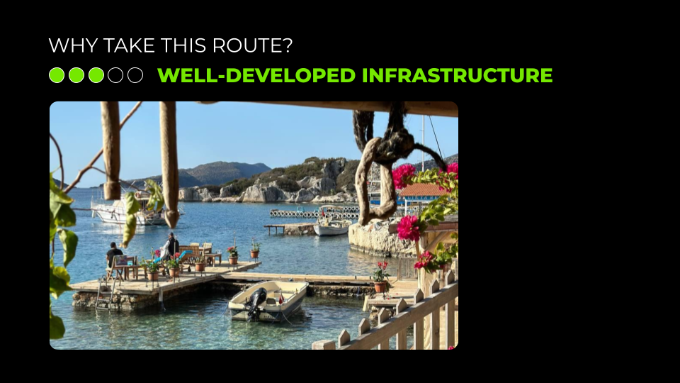
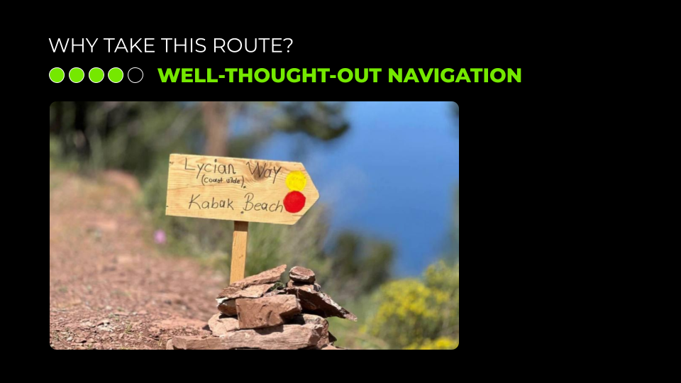
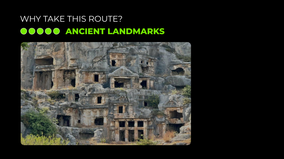
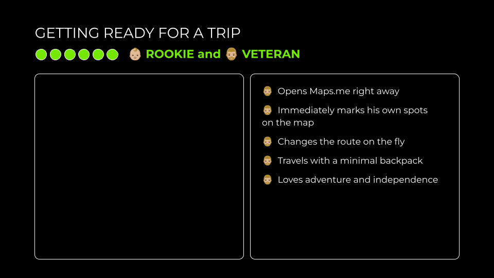
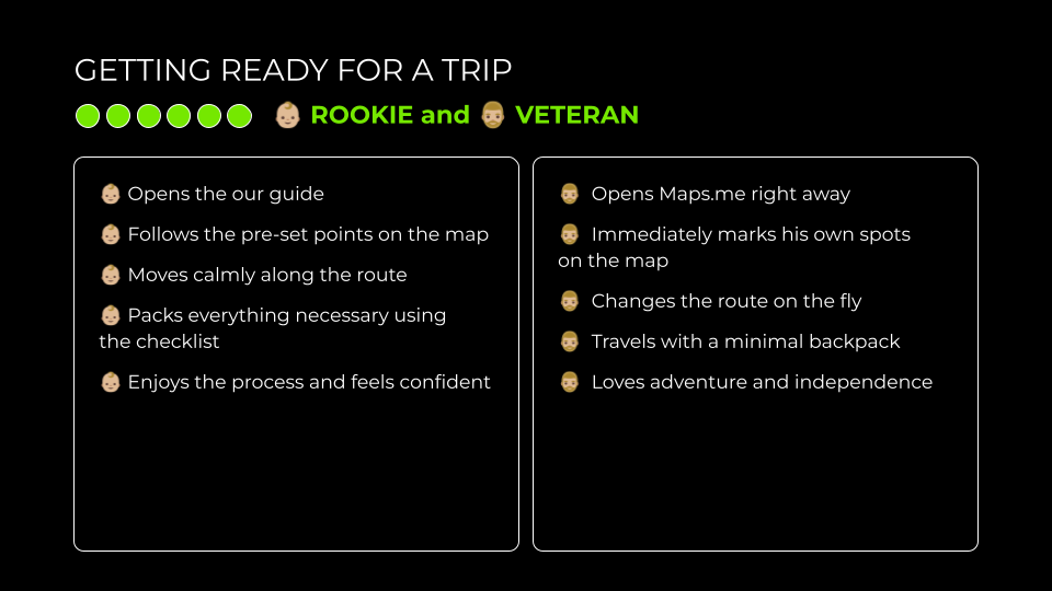
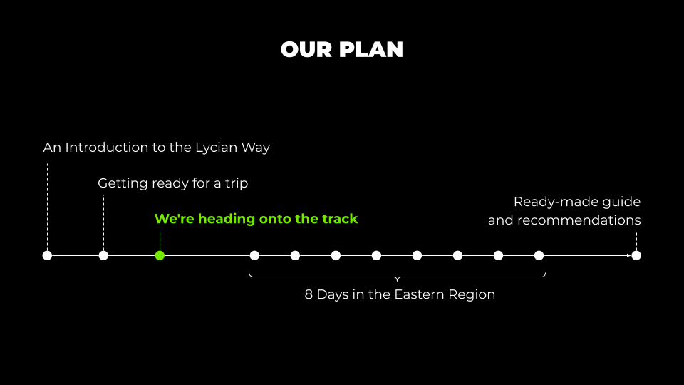
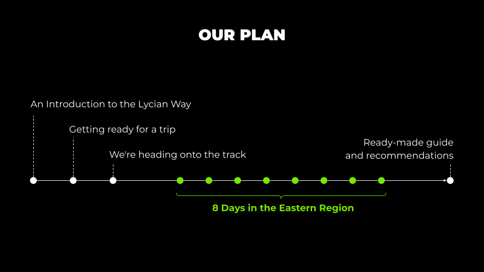
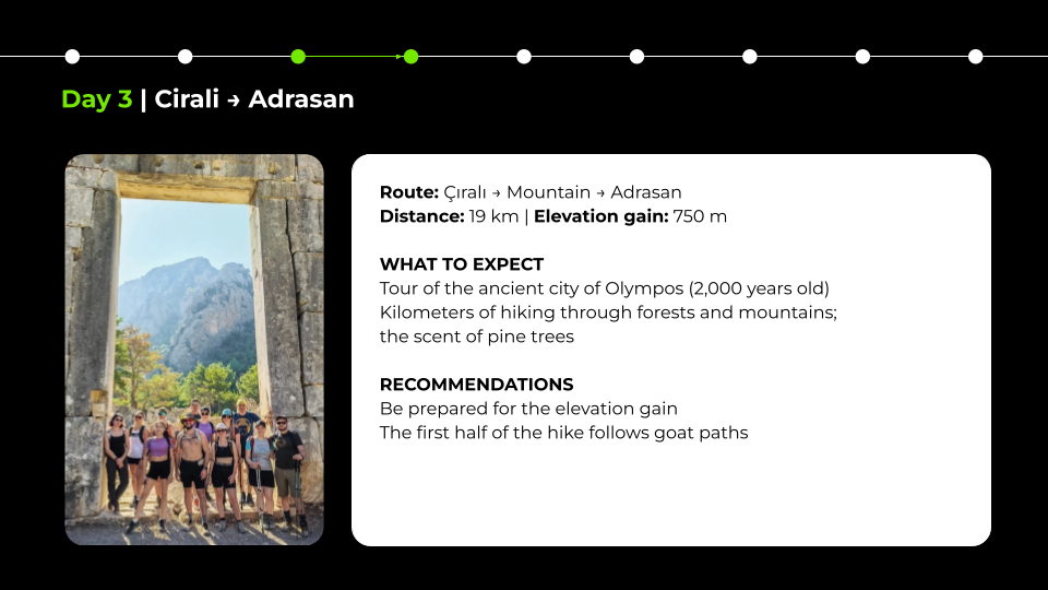
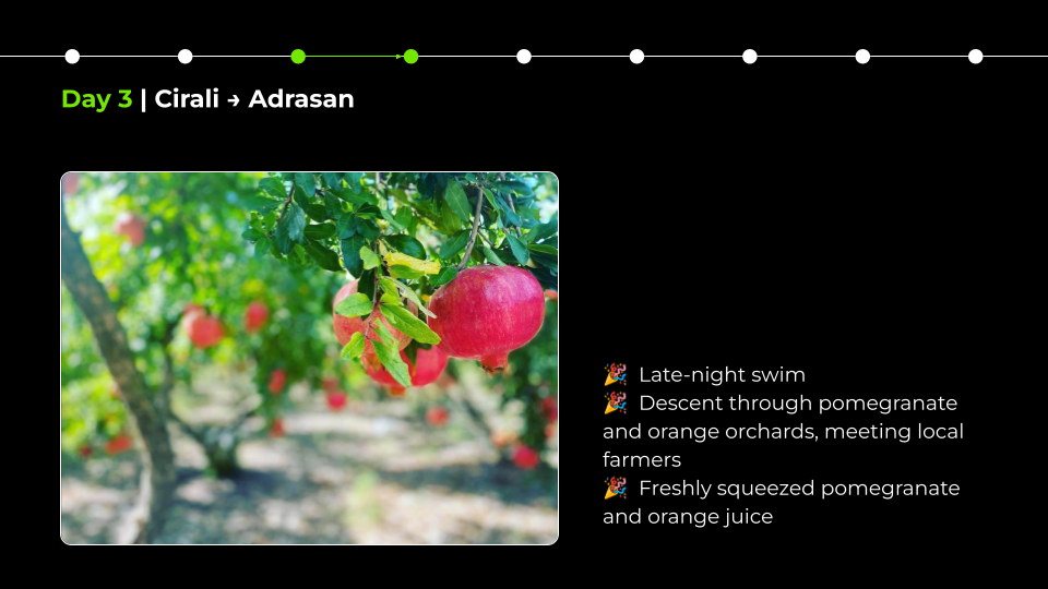
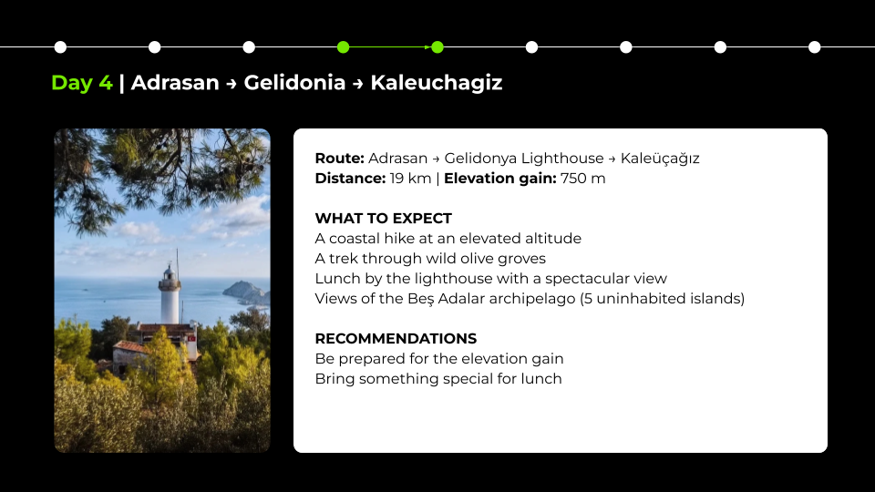
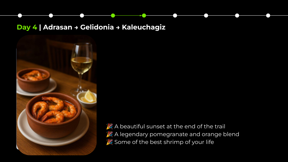
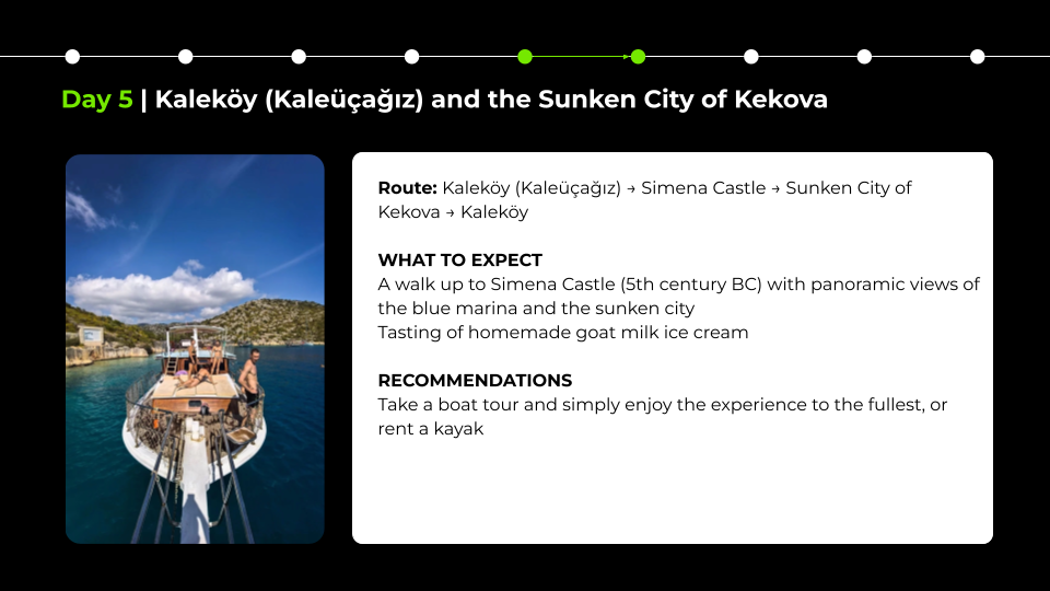
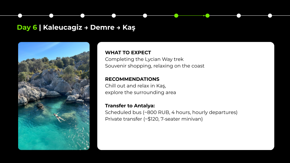
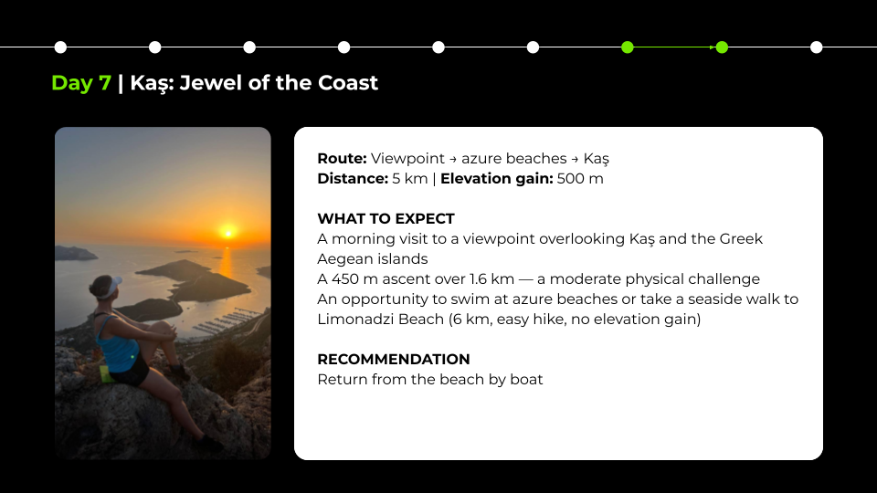
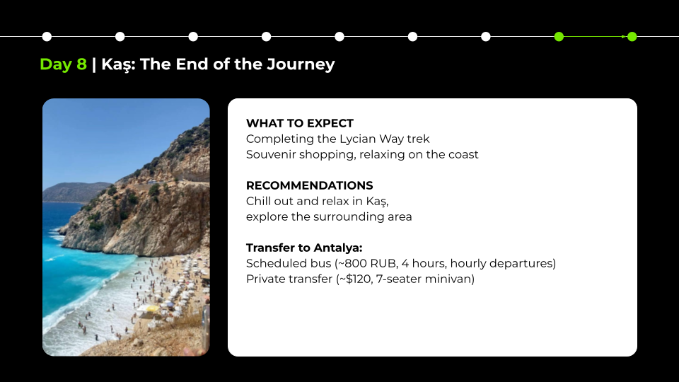
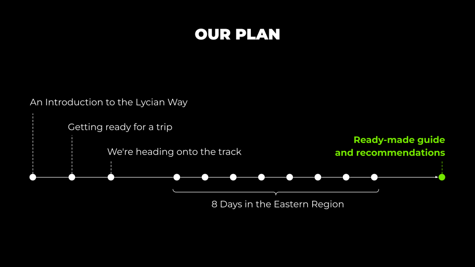
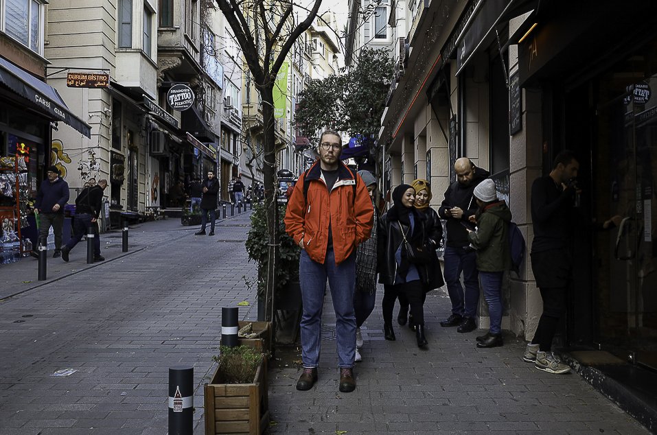
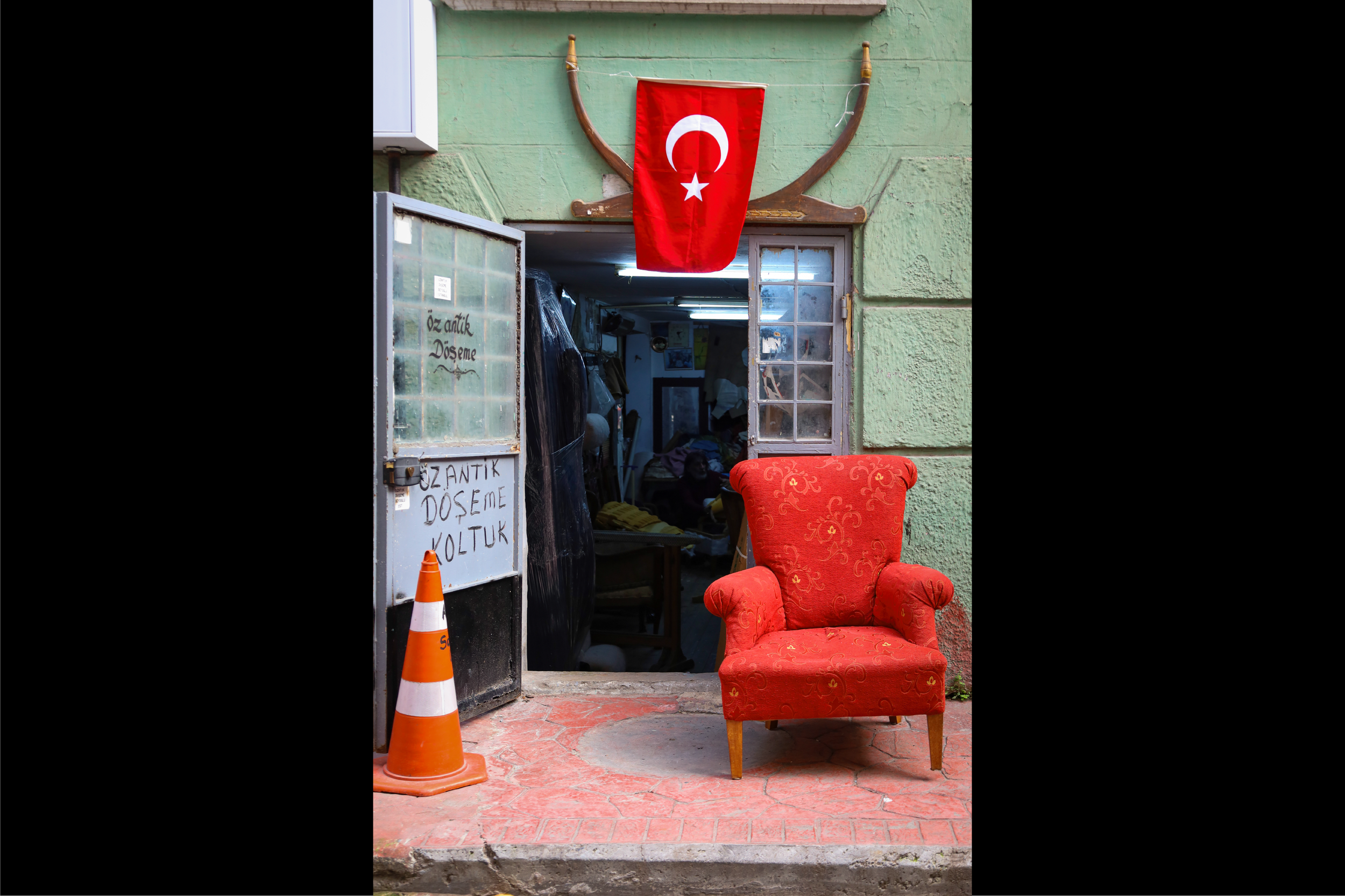
Lycian Way Hiking Guides Presentation
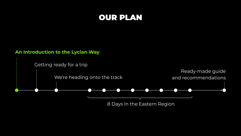
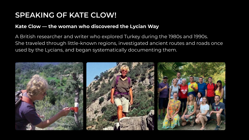
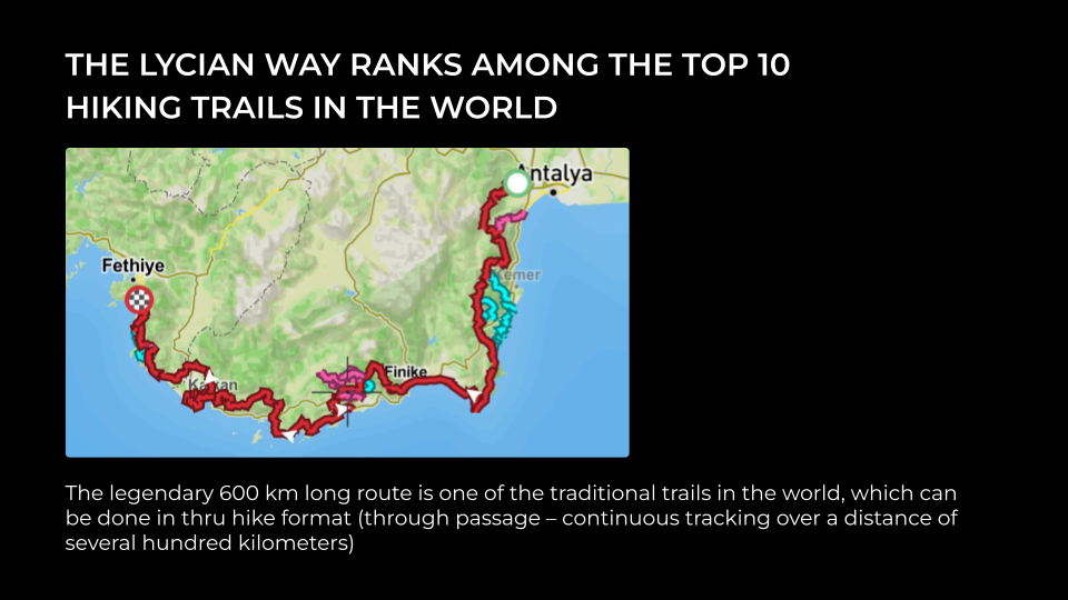
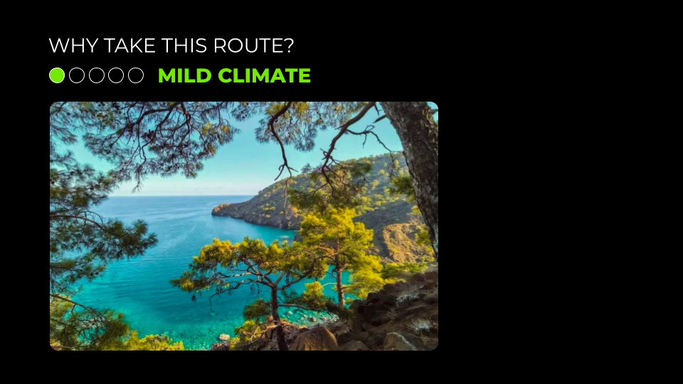
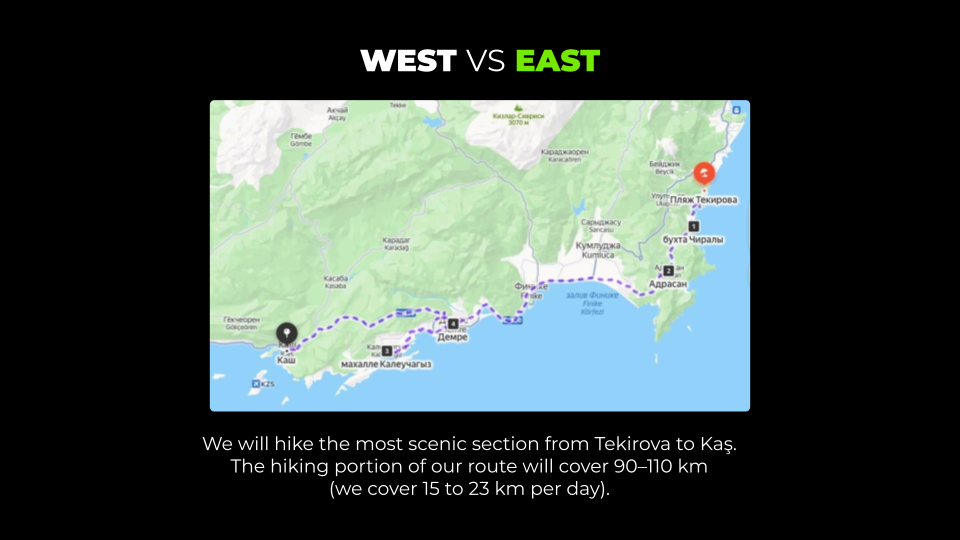
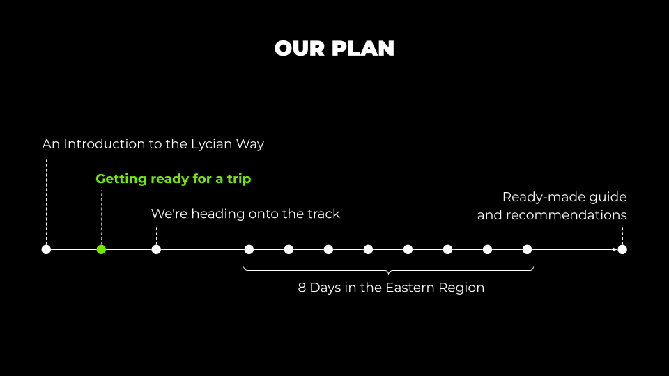
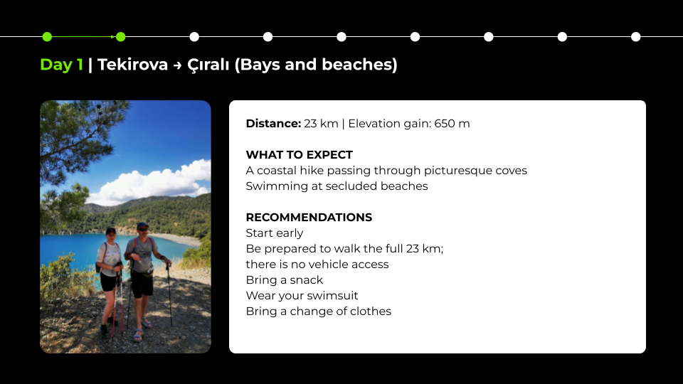
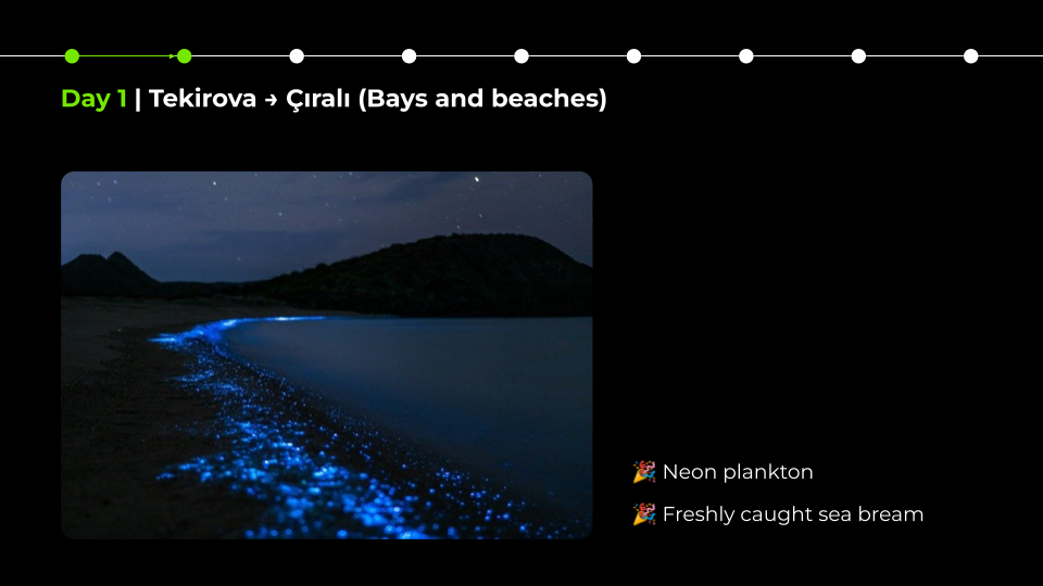
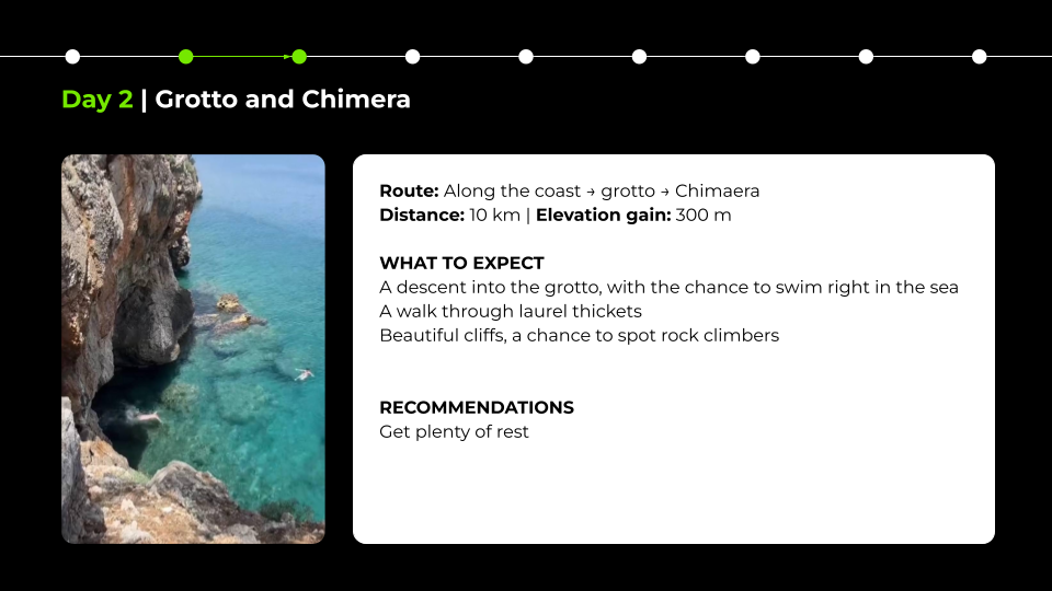
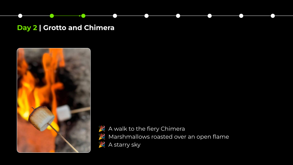
This presentation was created for two hiking guides presenting their author-designed route along a section of the Lycian Way at a public event in Tbilisi, Georgia.
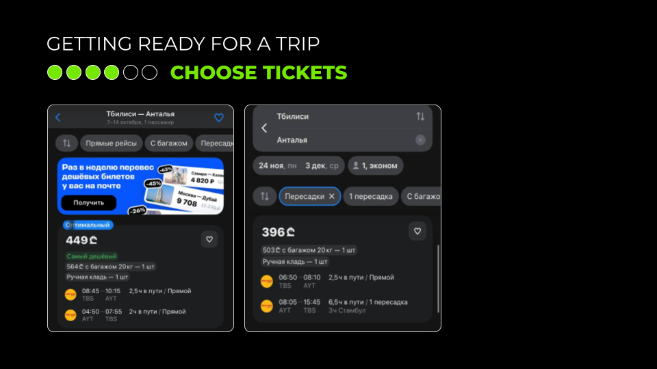
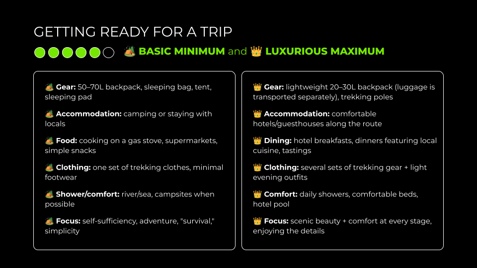
One of the key requirements was to keep a relatively large amount of text on the slides. The speakers wanted the presentation to remain useful both during the talk and afterwards, when it would be shared with the audience as a reference.
While I usually recommend reducing on-screen text, in this case the priority was supporting the speakers’ preferred presentation style. To make the content easier to follow, I structured the information into clear visual blocks and used progressive animations so that each point appeared only when it became relevant.




















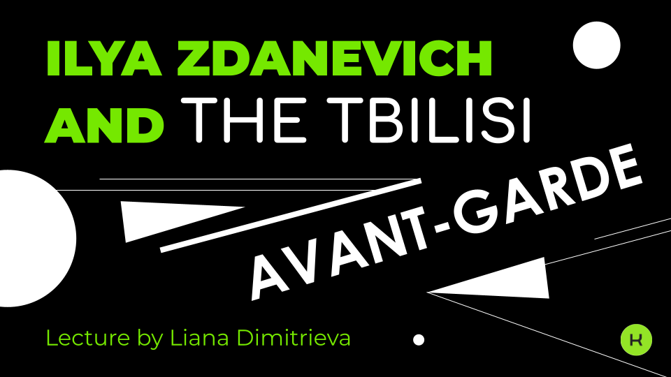
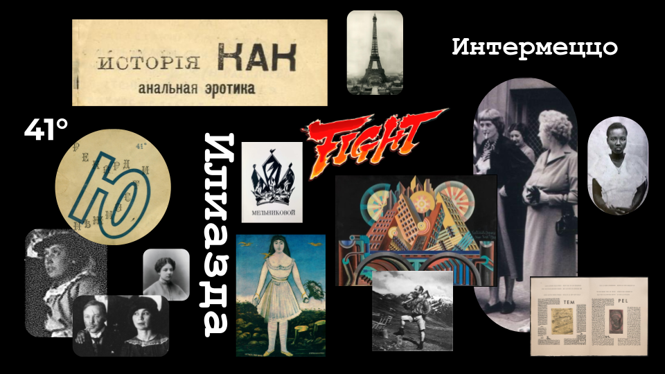
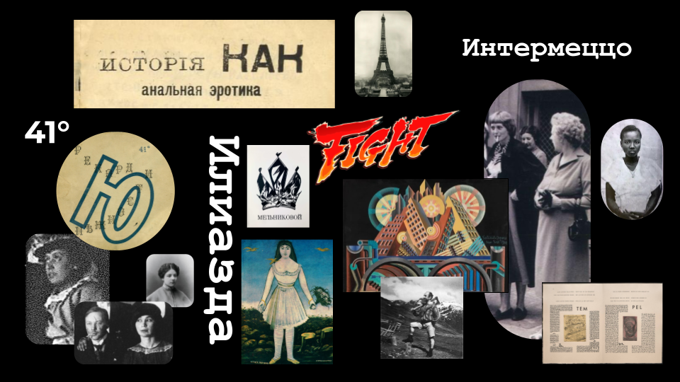
Presentation for a Lecture on Ilia Zdanevich and
the Tbilisi Avant-Garde
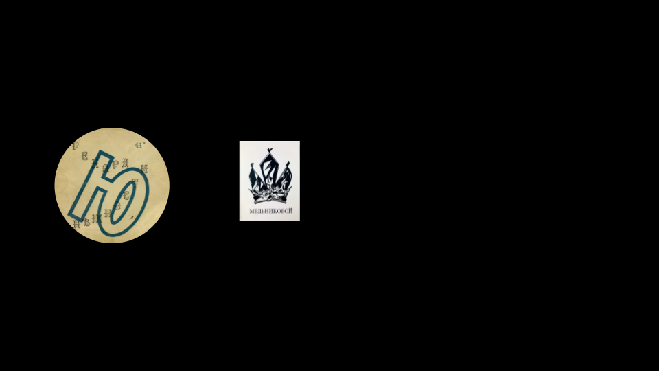
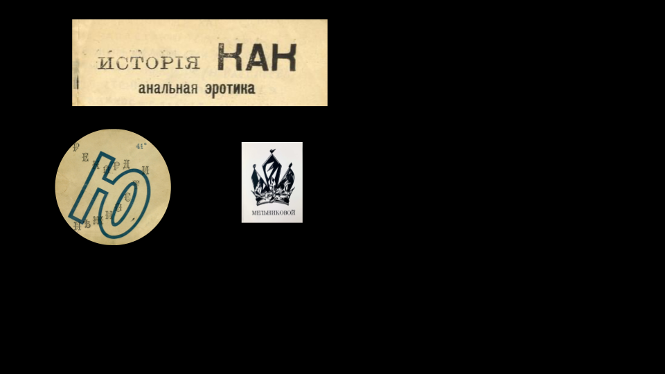
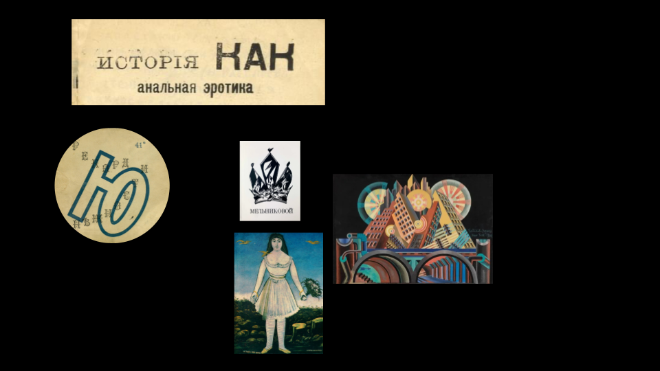
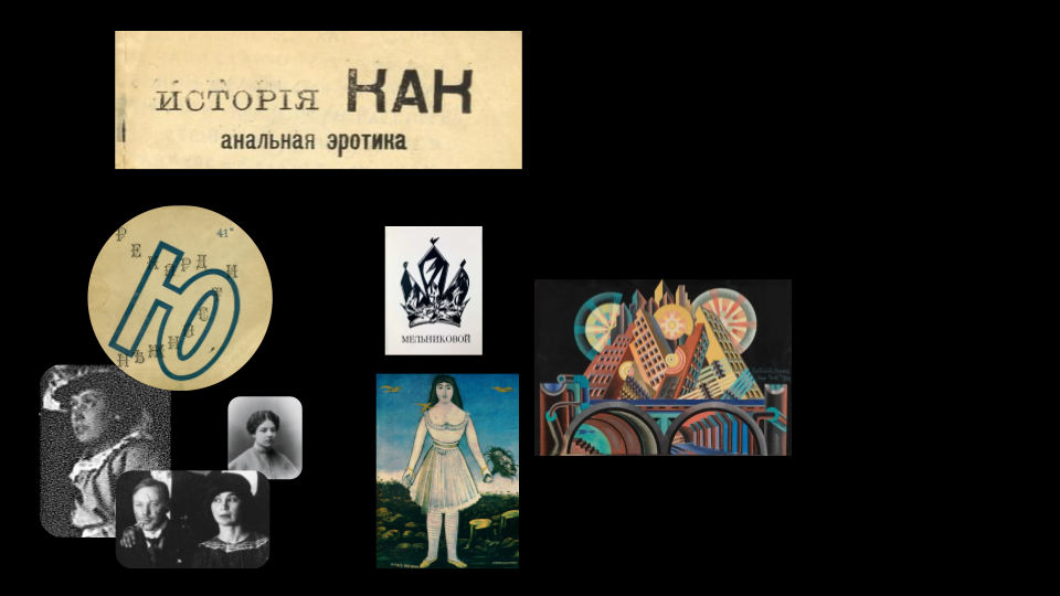
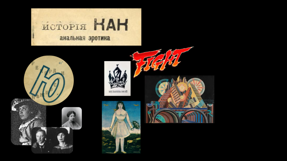
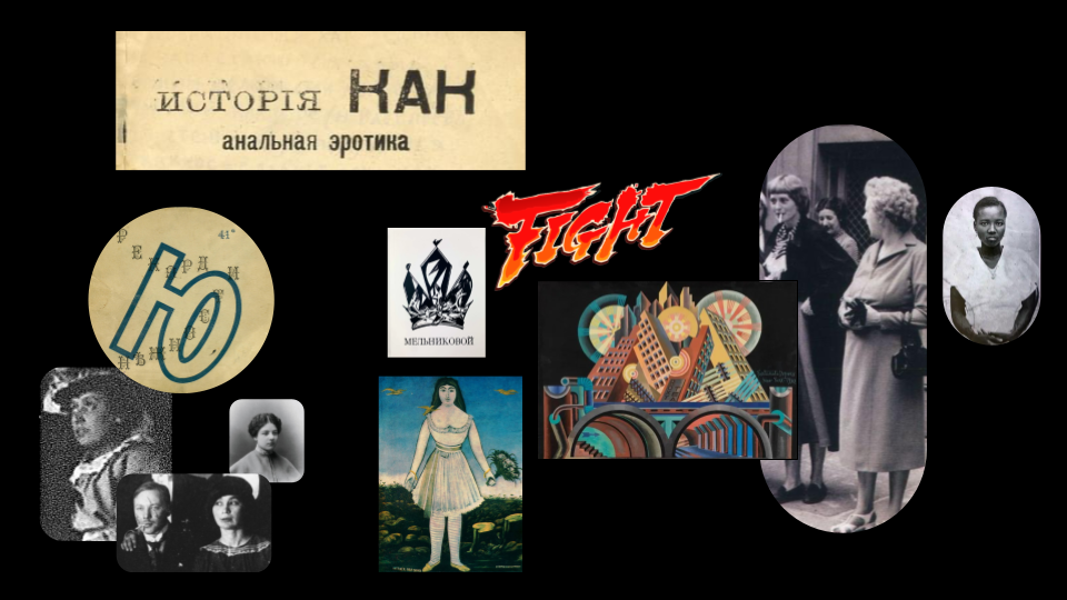
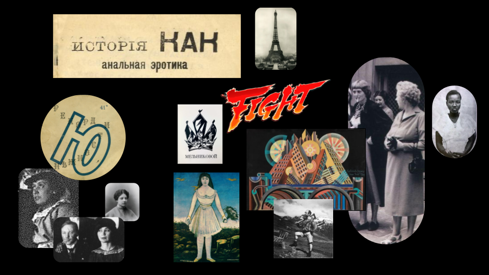
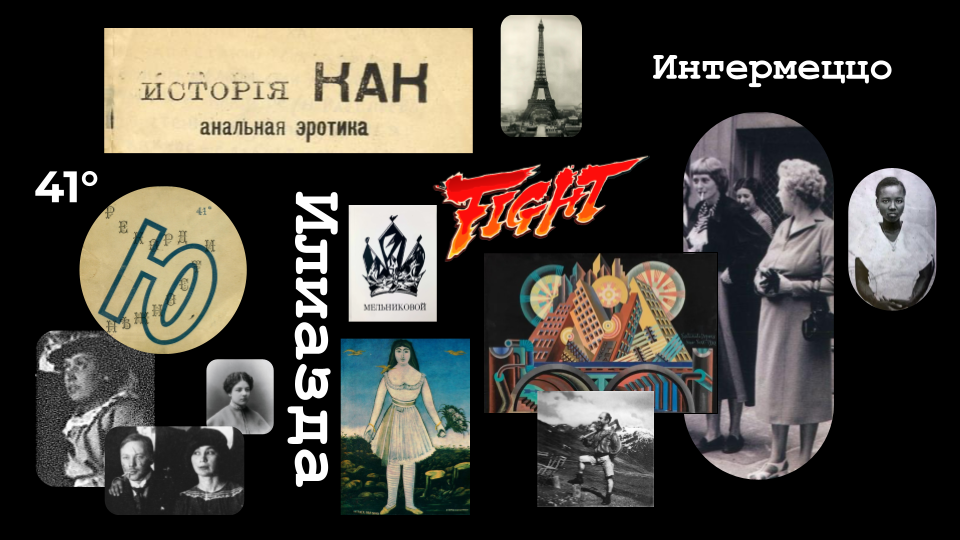
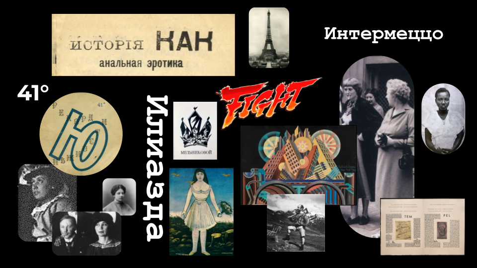
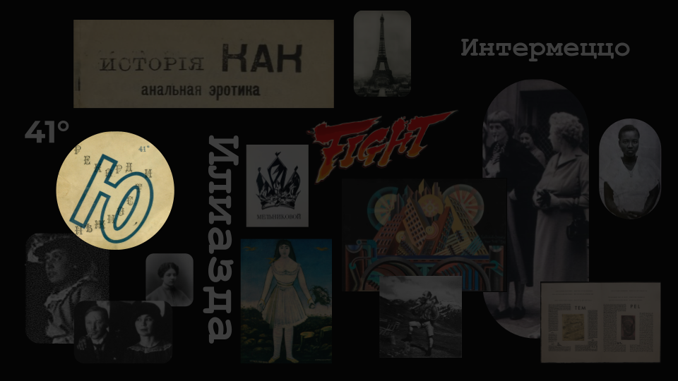
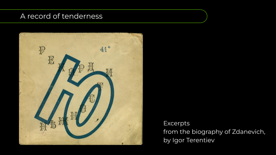
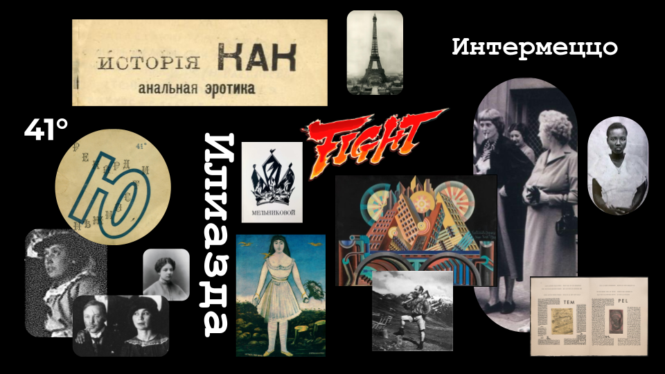
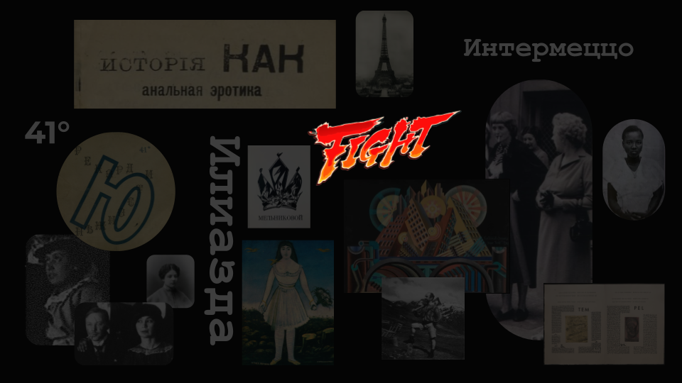
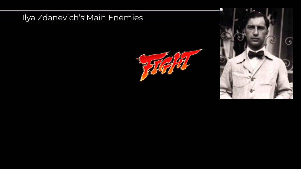
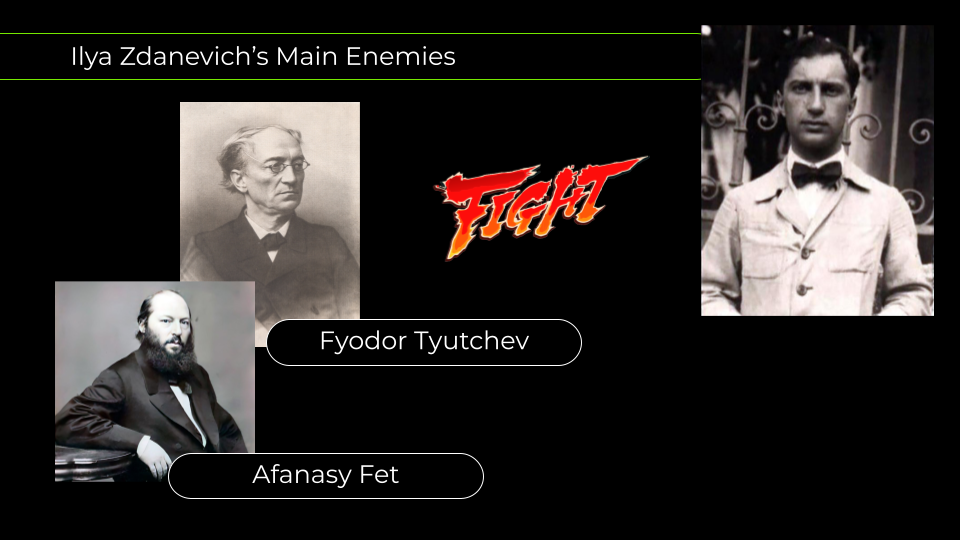
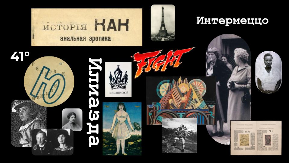
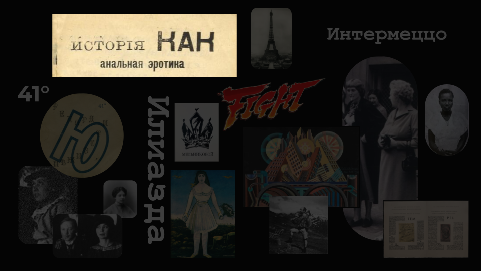
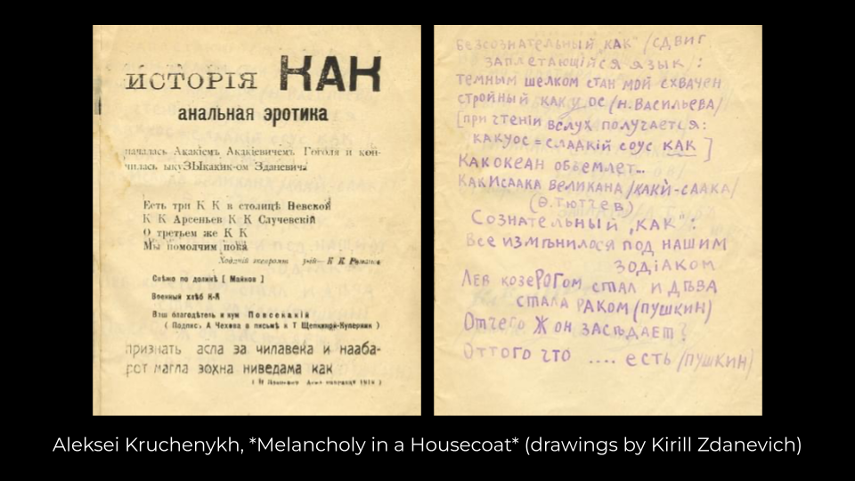
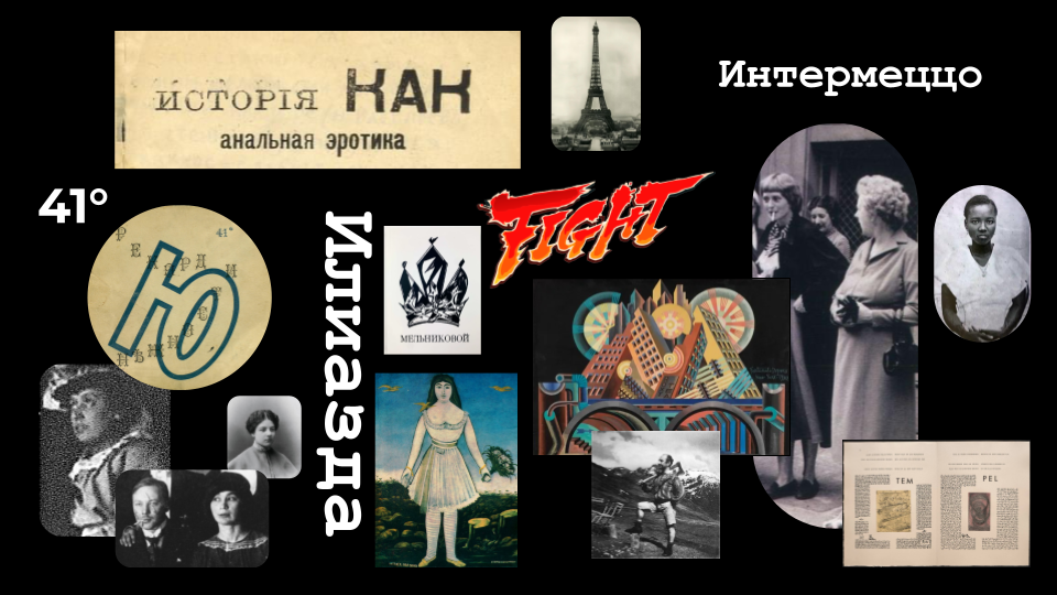
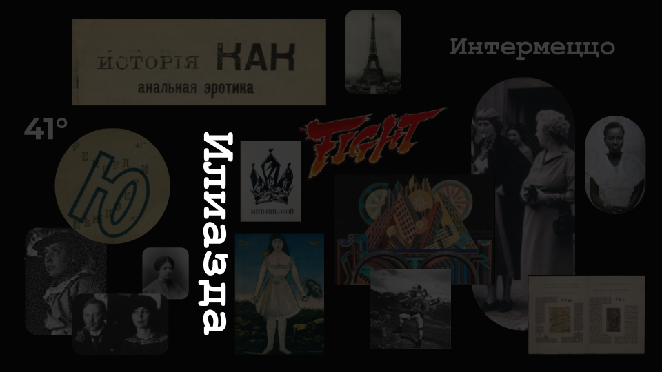
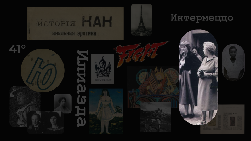
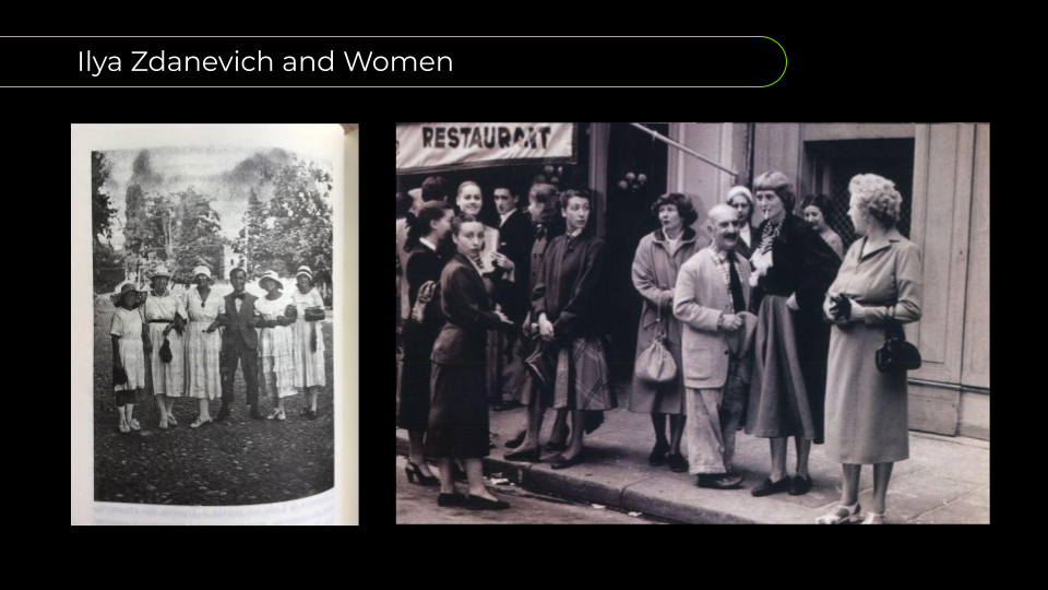
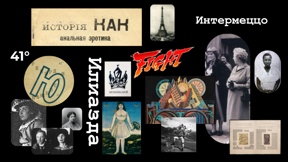
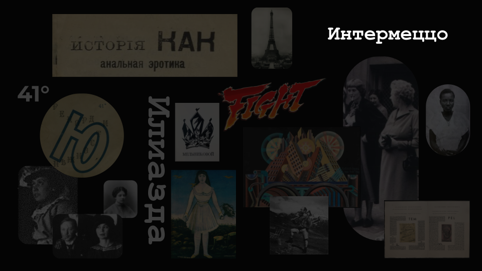
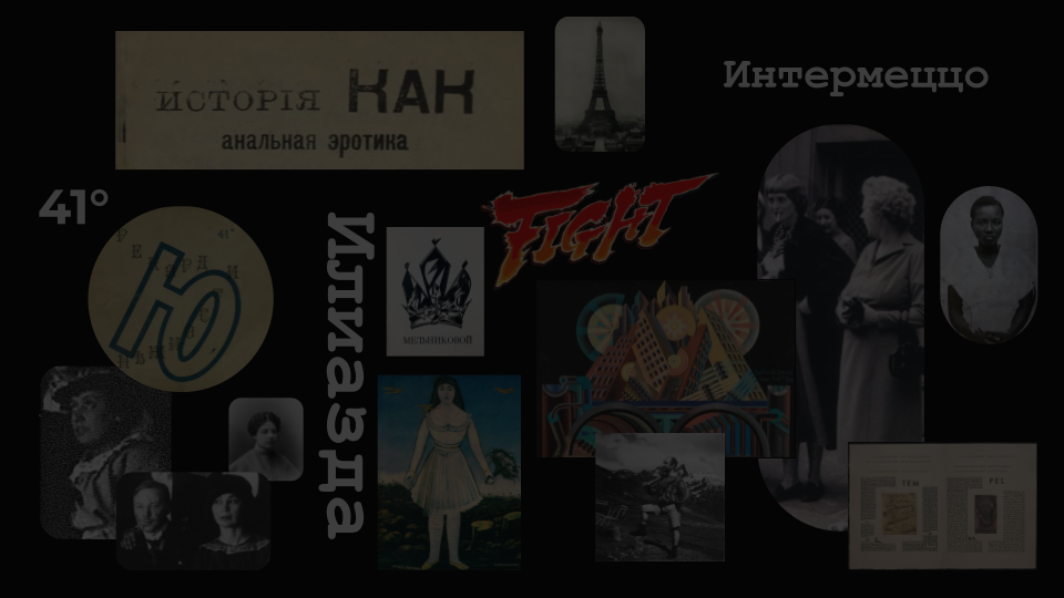
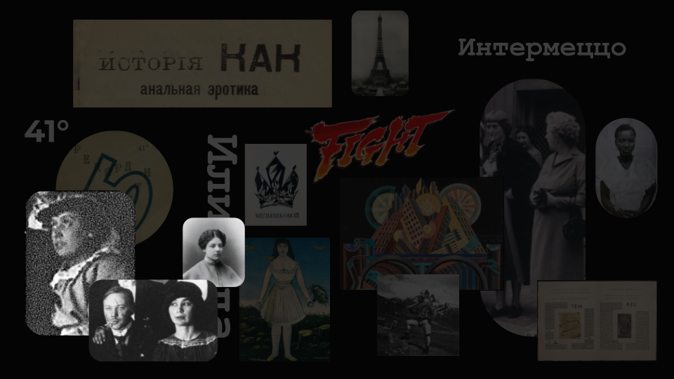
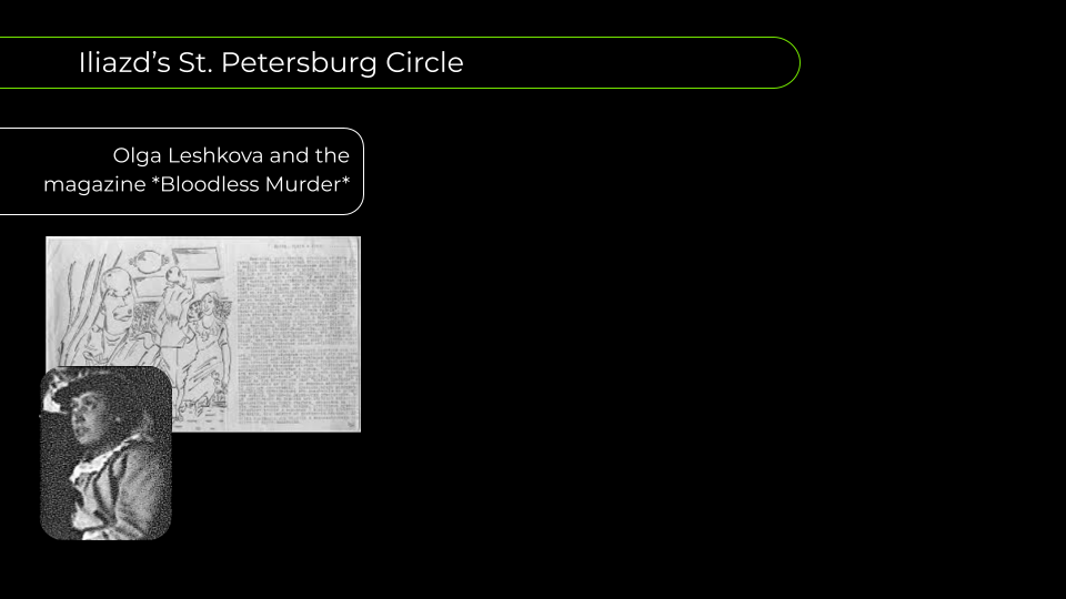
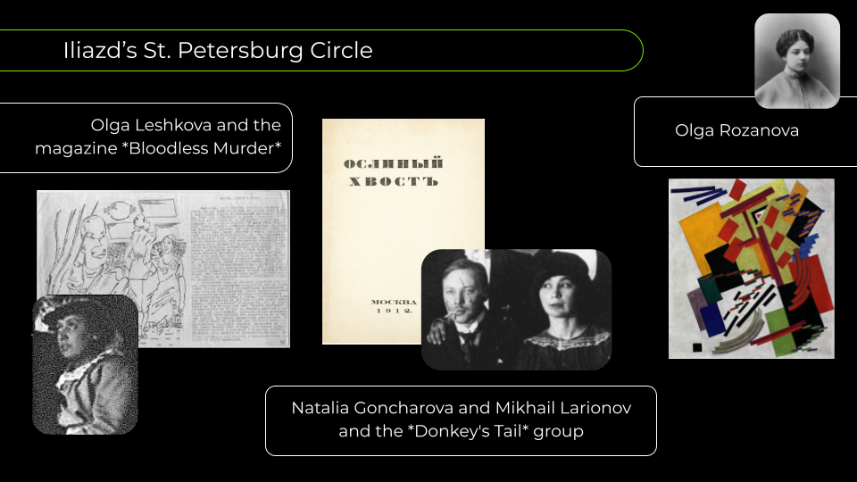
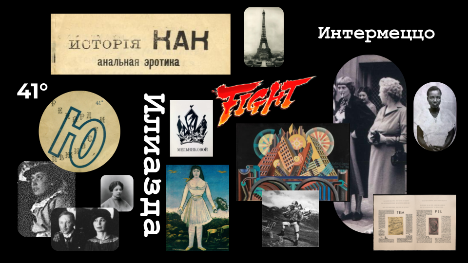
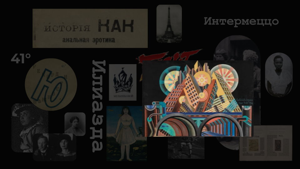
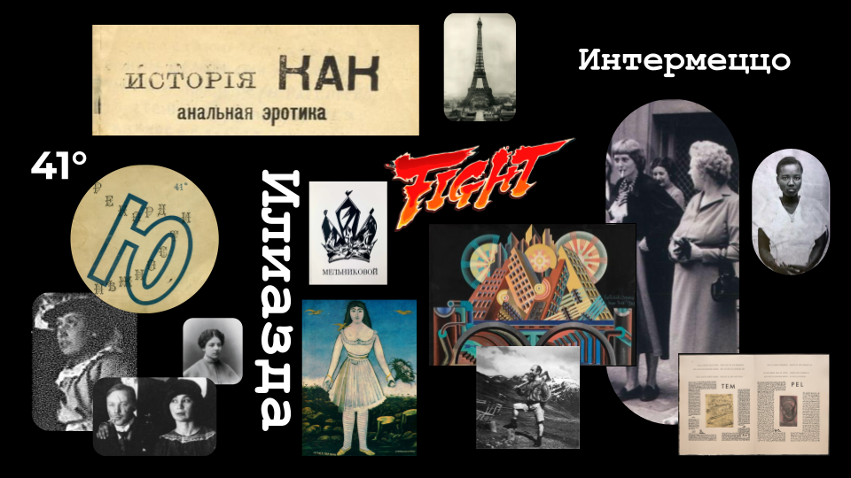
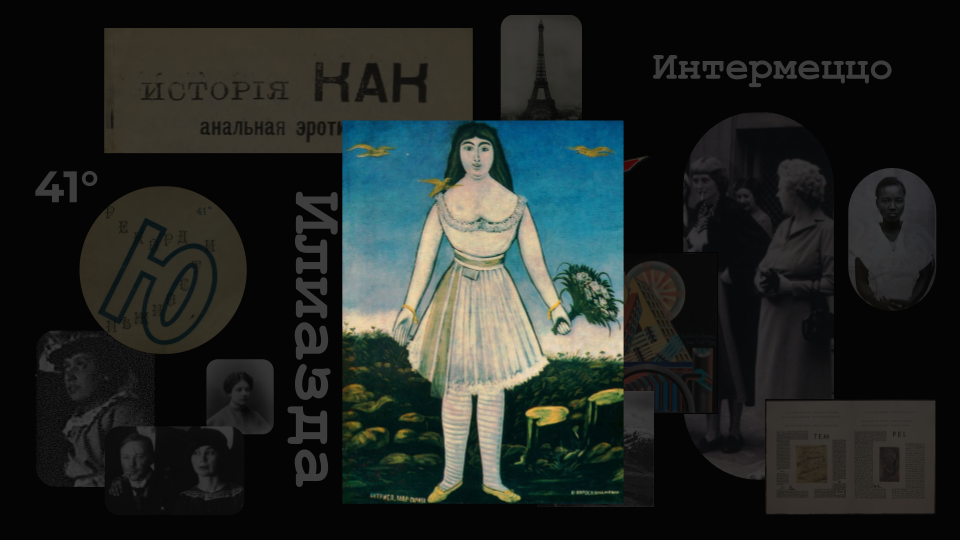
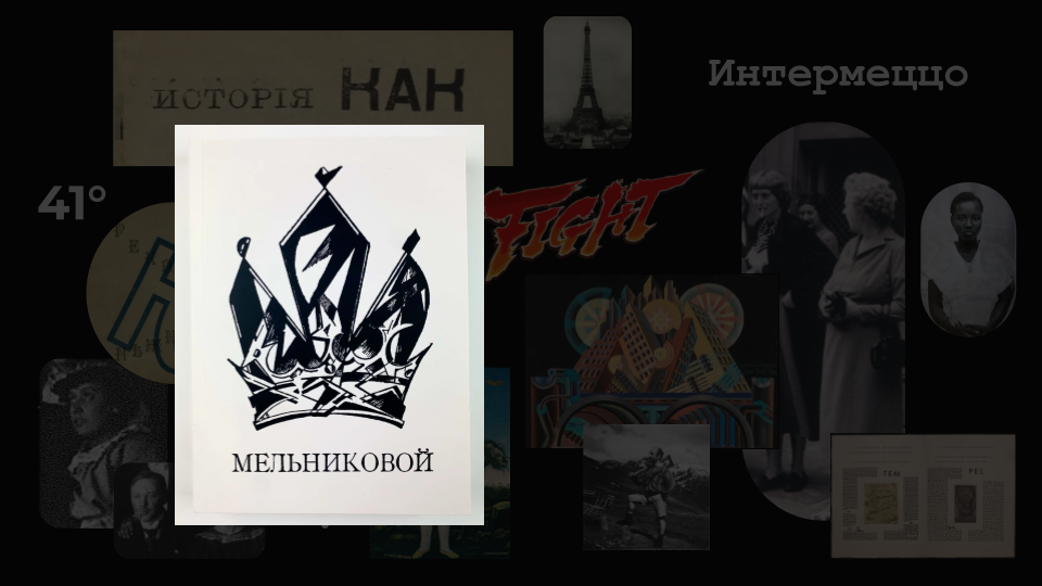
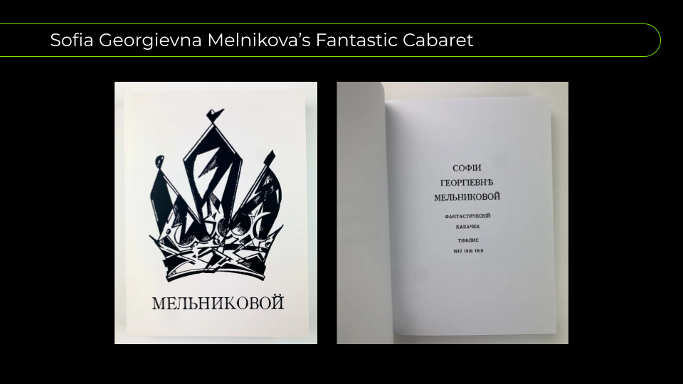
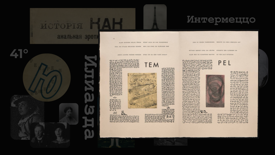
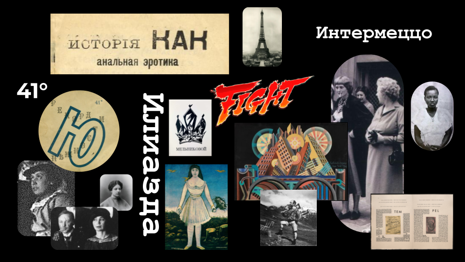
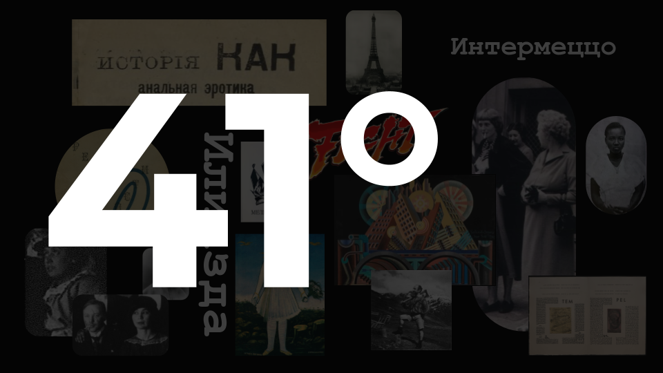
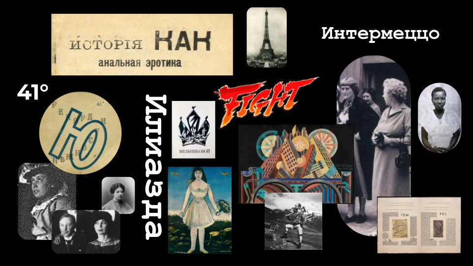
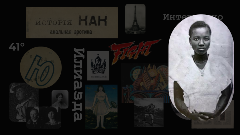
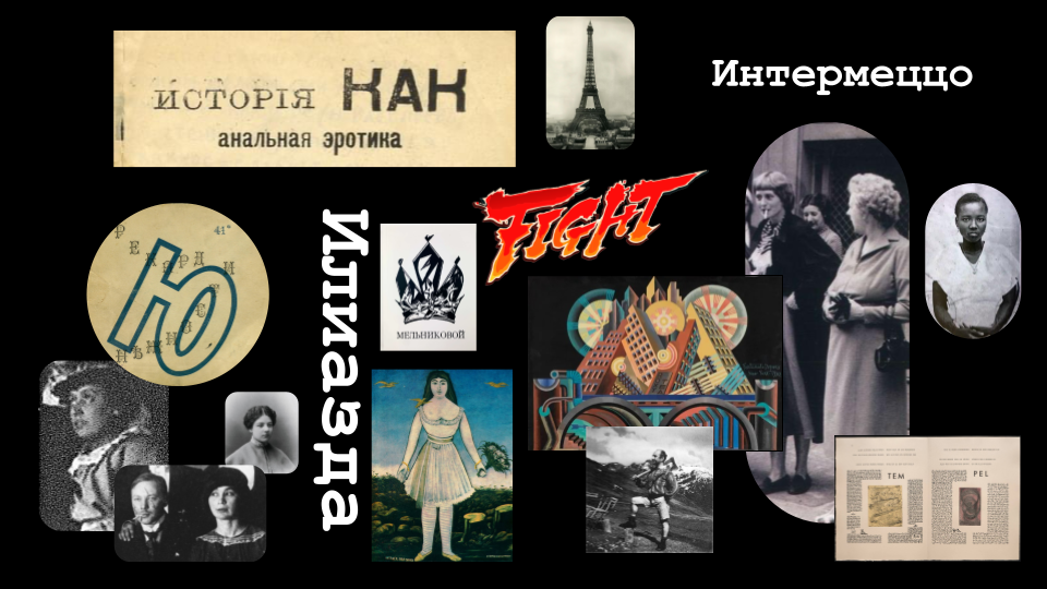
This presentation was created for a public lecture about Ilia Zdanevich (Iliazd) and the Tbilisi avant-garde. Unlike a chronological lecture, this talk moved freely between different episodes of the artist’s life, ideas, and cultural context. To support this non-linear narrative, I replaced the traditional slide navigation with a mosaic-like visual system.
Different sections of the mosaic became active throughout the presentation, helping the audience understand which part of the story they were exploring while preserving the lecture’s associative structure.
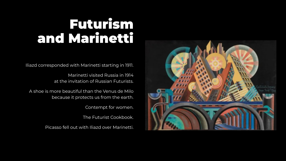
The presentation was created for Paper Kartuli and builds upon the visual system developed for the lecture series. While keeping the brand’s color palette and high-contrast design principles, I deliberately broke the underlying grid and introduced a more playful, experimental composition inspired by the aesthetics of the avant-garde.
Rather than imposing a rigid structure, the design embraces visual rhythm, asymmetry, and movement, allowing the presentation itself to reflect the artistic language of its subject while still providing subtle orientation for the audience.